Vanity Fair used to be the place every publicist wanted to have the cover of for their clients.
Under Tina Brown, then Graydon Carter, the covers were sensational, beautiful, sometimes provocative.
But since Radhika Jones took over, ‘ugly’ has been the main description. Month after month, celebrities on the cover of Vanity Fair look like they’re in pain.
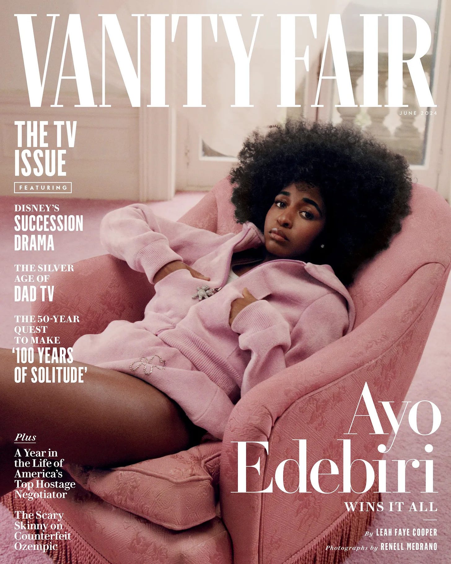
That’s certainly the case this month for Ayo Edebiri, star of “The Bear.” Could they have made her look any worse? Renell Medrano, the photographer, is certainly no Annie Leibovitz, or Jonathan Becker.
I’ve met Edebiri many times since “The Bear”
exploded into a crossover hit. On the show, her character, the ingenious Sydney, is as clever and cute as she could be, even when the marinade is turning bad. In person, I actually told her recently, You’ve become too glamorous! (Sydney is not this glam! She laughed.) Ayo Edebiri s a talented, smart, beautiful young woman.
So why does Vanity Fair make her look so awful? Ayo is slouched back from the camera in a huge pink chair, wearing a bland colored pink hoodie — an expensive one, no doubt, that becomes the main feature of her portrait. Her face is hidden and she looks nothing like Ayo Edibiri. She looks unhappy, or scared, and I can tell you why: she knows this is wrong.

There’s more of this inside the magazine. For some reason, the editors didn’t want to use color photos of Ayo. Everything is washed out. The only decent picture is on Page 46. It’s in stunning color. The actress looks like herself. There’s real expression. You might see that on a newsstand and recognize her. God forbid.
One more problem with the Vanity Fair cover. The cut line is not helpful. Under Ayo’s name, the cut says: “Wins At All.” Wins what. What are you talking about? There is no reference to “The Bear.” Nothing, nada. Are we playing a game here? It should have read something like “Ayo Edebiri: Bearing Up” or “Cooking with Gas on The Bear,” or above her name “The Bear’s”, and below her name, “Chef’s Kiss.”
Everyone I know talks about how Vanity Fair is no longer an important read. It’s an Oscar party. Otherwise, the magazine has none of the resonance of its halcyon days. I know Jones wants people of color on the cover — which is great, wonderful — but use a bright palette against seamless white like they do for white stars. Make the covers snap, shine, and be witty— Ayo could have had some unusual kitchen tool in her hand. They did this to Simone Biles, too. That cover was horrendous, too.

Miscellaneous VF rant: Glenn Powell on the inside for Hit Man? Huh? Jean Smart relegated to the back page? (Isn’t this the TV issue?) And the magazine is only 106 pages. Very disappointing.
PS Simone Biles, from February. Believe me, Nicole Kidman or Penelope Cruz would not be presented this way.


